We are back again, magnifying glass at the ready, to closely inspect the brand new Spring 2022 collection by JJ Adams - in order to save you all squinting your eyes at your computer for endless hours trying to figure out all the detail in each piece. So sit back, relax and let us take you on a wild ride through what is arguably one of his most intricate and unique series of works to date...
It's the work event you don't want to miss .. JJ has created what appears to be a small, law abiding gathering in an obvious extension of the office... Big Ben. (Or do our eyes deceive us here?! Maybe we need to hop in the car and take it for a spin, just to test them... )
Naturally, we had to kick things off with the sensational 'Big Bender' inspired by the recent 'Partygate' scandal that has been dominating headlines in the UK for months. Even with the strobe lights flashing and a disco ball twirling, some may still deny that there is a party going on inside but there is one thing no-one can contest - that this work is bursting with hidden gems and comical references to the whole fiasco.
Ok, so I don't know if it's just me but the first thing to completely blow my mind here? HP Sauce. On average a whopping 28 million bottles of the stuff are consumed a year and it's become such a common sight in homes and cafes across the country.. that maybe it doesn't even cross our minds what HP actually stands for. Anyone who is familiar with JJ Adams art knows that nothing finds its way into his works by accident, which led me to ask that question myself. HP = House Of Parliament. (WHO KNEW, RIGHT?) Developer of the condiment Frederick Gibson Garton registered the name HP all the way back in 1895 after discovering a restaurant in the House of Parliament was serving it. The label also features Westminster and of course, Big Ben standing proudly in the center. Just above the HP label you will spot a banner with the now infamous line from Boris Johnson himself sprawled across it 'I thought it was a work event' and the anti - conservative twist on the well known Tesco logo 'Tories - Very Little Help' that has seemed to have popped up across the country in various forms over the last few years. In true JJ fashion, you have to take an extra close look to spot the figure hiding just above the banner but I can confirm.. that the Grim Reeper himself is lurking around the floors of the tower.
The clock face on Big Ben has been replaced by what appears to be a Seiko Mickey Mouse watch (maybe because at this point they are, uhum...taking the mickey?!) if you look up a little higher you'll find a Vote Labour banner with the 'A bunch of rich people convincing poor people to vote for rich people' slogan printed on to it and just a little higher, sprayed onto the wall of Big Ben, are the words 'Without Money We'd All Be Rich' .These two additions seemingly illustrating JJ's own political stance. Then, we get to the main event.. the party. And oh my, does it look like it's a wild one. Pink and orange laser lights radiate out from inside the famous landmark and their appears to a be a number of well dressed men, looking a little worse for where.One is just barely managing to prop himself up on the side of the building, another has given up completely and is now passed out and on the ledge at the very top of the tower is another, who seems to be flipping off the Metropolitan Police Helicopter hovering above (probably because they are about to dish out a whole load more fines). More additions to this work is the diver seen jumping off from the tower, the 'Stay Home' motto painted onto the roof and an Acid House Smiley balloon floating away from the 'rave' scene. Down at the bottom corner of the work you'll spot a copy of JJ's sold out 'Mary Poppins - Stay Home, Save Lives' the piece released during lockdown to raise money for the NHS.

With the original 'Bullitt' still being one of our most requested JJ Adams works to date - fans will be delighted to see another rendition of the King Of Cool in the role that many consider the turning point in his career. With it also recently being announced that Steven Spielberg is directing a new original story centered on Frank Bullitt, the iconic character played by Steve McQueen in the 1968 thriller - this couldn't really come at a better time. In the work we see McQueen aiming a revolver with one hand, while holding one in the other in the stark surroundings of the Californian desert. Of course, there are references to both of the previous McQueen inspired works JJ has created over the years with parts featuring on all three like the 'Cool King' knuckle tattoos and the recognisable inking of McQueen on a motorbike in The Great Escape. In the 2015 'Bullitt' work, Frank's Ford Mustang appears as a photograph on the wall and in the later 'Cooler King' it features as a tattoo on McQueens forearm. In this new work, the car appears in its true form - parked up in the background of the piece, awaiting the actors return. All three depictions present the watch made famous by the film - the Benrus 3061, now named the Benrus Bullitt, but in the newest edition JJ has also highlighted another couple of the actors staple pieces of jewelry. Around his neck hangs a 9ct gold St Christopher medallion on a thin chain which fans often spotted Steve McQueen wearing. The pendant was a gift from his first wife Neile Adams, as he had become quite religious towards the end of his life. Another signature piece the actor was never seen without was a signet ring also appearing on his fourth left finger in this work. This was a personal item of McQueens, but it did make it's way into a few of his most famous films including The Great Escape and Wanted: Dead Or Alive.
Secure Bullitt From A Gun Colour Here & Black and White Here

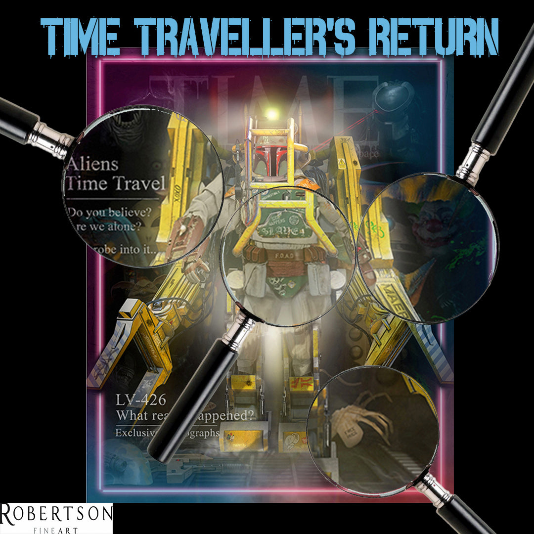
What is more mysterious... possible alien existence, or all the detail hidden in 'TIME Traveller's Return? Looking at the piece above I'd have to go with the latter but no stress, as I am on hand to give you a bit more insight into this extraordinary image. A perfect mash up of all the best sci-fi movies and characters that the film world has to offer, we see legendary Star Wars bounty hunter Boba Fett at the forefront of the magazine cover. Not your typical depiction of Boba but you may just recognise this version from an earlier piece of JJ's. This is the same Boba Fett as appears in the immensely popular and now very rare 2015 'It's A Trap'. Featured on his armor you will find the same tattoos and markings like the 'Slave 1' chest piece, a tribute to his pursuit craft inherited from his father, 'Sith Happens' the notable play on words that appears on many JJ Adams Star Wars inspired works and the 'Yoda Soda' sticker.
This piece sees him in a get up that's very unfamiliar to the character - pulled out of the land of Jedi's and placed straight into a P-5000 Power Loader exoskeleton from the Alien franchise. When you start to look around it becomes apparent that this is not the only Alien reference in the work, with various characters emerging out of the darkness behind. At Boba's feet you will spot a worm-like 'Hammerpede' and a parasitic 'Face Hugger' crawling around with the words 'Free Hugs' playfully placed on it's back (which is something you definitely DON'T want to take it up on) You will discover a Dog Alien from the 3rd film to the right and there are even references to the Alien Predator cross over, with Predator and a Predalien both appearing in the top corners of the piece. But oh no, those aren't the only sci- fi inspirations JJ has pulled together for this epic artwork.. Be prepared to be transported back in time, as characters such as a martian from Mars! Attack, JoJo the Klownzilla from Killer Clowns in Outer Space and even a Dalek from Dr Who all begin to emerge. A large Warrior Bug from the 1997 Starship Troopers has positioned itself just behind Boba Fett and another Star Wars character, the kowakian monkey-lizard Silacious B Crumb, can be seen peeking out from beside the Power Lifter.
There is no icon who marries so impeccably with the edgy artistic style of JJ Adams - than the most controversial supermodels in all of British history, the one and only Miss Kate Moss. JJ has encapsulated her beauty, allure and party lifestyle in this eye-catching portrait - where we see her don a biker jacket, vibrant streaks in her hair and some signature additions of piercings and tats for that extra 'punk' vibe.
On the badge on her shoulder you will read the shortened version of one of Kate's most famous lines:
"I would have wanted to be a rock star, a lead singer, if I wasn’t a model. I’d go touring in a bus with my band. In my next life, that’s the plan.”
JJ has re-imagined a world where she has been transformed into just that - a rock star. Kate's knuckle tattoos spell out the words 'Rock Star' and the back of her hands are adorned with inkings of the national flower of England, the rose. Some may say Kate Moss falls into the category of an 'English Rose' herself due to her natural looks... but a wallflower she most certainly is not.
She rose to fame in the world of modelling because she went against the grain in every way, especially with some of her more questionable habits. Drug scandals, controversial partners and being the face of the highly criticised 'Herion Chic' phase of fashion history.. it seems even more appropriate that the title above Kate's head has been cleverly altered from 'Vogue' to 'Rogue'. We can't forget to mention of course, that JJ has sneaked in his trademark spider web tattoo into this work and you'll find them on the collar of Kate's jacket, completing this piece perfectly.

Where to even begin with this one?! This tribute to the magical Harry Potter franchise is so jam packed with hidden elements and references that you could almost believe Harry Potter himself might burst right out of the image on his Nimbus 2000 and swoop into your front room. In terms of detail, this is by far one of the most complex works we have witnessed from JJ to date and there are definitely many parts to this piece you will overlook on first, second or even third glance. Making the task of uncovering them all for you harder than Snape's Potion Riddle... but Iv'e given it my very best shot, so here goes....
This isn't your 'stereotypical' scene of Hogwarts from the movies (well of course not... when does JJ Adams ever do anything by the book?!) Instead, this work paints the picture of the School of Witchcraft and Wizardry consumed by darkness. The ‘Dark Mark’ in the corner of the sky alerts us to the fact that evil is lurking. Dementors hover above in the thundery night skies as Aragogs, dragons, Mountain trolls and werewolves can all be spotted stalking the outer walls of the castle. From an entryway to the school on the right, the large Basilisk rears it’s ugly head, warding off any good who tries to get close… But it’s not all evil beasts taking over this image, oh no, there are some more admirable creatures hiding out here too. Fawkes, Dumbeldore’s pet Phoenix can be found flying off into the sky, Harry Potter’s noble Patronus can be discovered at the center of the work as a magical Hippogriff takes flight close by.
Around the turrets of Hogwarts, Harry Potter can be spotted whizzing around on his Nimbus 2000 leaving the words ‘Catch Me If You Can’ in his trail and of course, it wouldn’t be a true portrayal of this magical story without the addition of the flying Ford Anglia 105E.
Now, it will be no surprise that this magnificent building has been given the special JJ Adams Rule Britannia treatment and is now covered from top to bottom in graffiti… but not just any old graffiti. As we've said before, there is always a reason for every aspect of JJ’s work and that becomes obvious when you notice phrases like ‘Bloody Hell’ ‘Voldemort’ and ‘Umbridge Sucks’ all sprayed onto the structure. Beloved lines from the film like “I solemnly swear that I am up to no good” and “Mischief Managed” appear on the roofs and even portraits of Ron Weasley and a tribute to the late Snape actor Alan Rickman can be found nearby.
Not everything in this piece is so easy to find however… it will take a bit more effort to spot aspects like JJ’s tiny little signature window with the curtain, or the Deathly Hallows symbol located just above it. And here’s a little game for you… when you finally get the opportunity to see this work in person why don’t you play ‘Where’s Mary’ because as bizarre as that sounds yes, Mary Poppins silhouette is hiding somewhere in this work. This refers to the suggestion that the world of Mary Poppins and Harry Potter crossed over as in 1910, Mary was a star employee for the Ministry of Magic - and therefore a member of the wizarding world.
There’s so much more we could talk about with this creation but as I am on a word count here, I want to leave you with one last little anecdote that really grabbed my attention in this work. The bridge at the forefront may appear as an exact replica of the connecting element of the Hogwarts school in the film, but on closer inspection you will discover the words ‘Give Peas A Chance’ sprayed onto it. Some of you may be asking..where does this appear in Harry Potter?! Well the answer is.. it doesn’t. It did however, once exist on the Chalfront Viaduct, located on London's M25 (The same road you'd use to travel to Harry Potter Studios). ‘Peas’ was reportedly the name of a London graffiti artist who daubed his name on the bridge, only for someone later to add in the words “give” and “a chance”. For many years this notable slogan remained on the bridge until 2018, when the word Peas was painted over by another London graffiti artist ‘Helch’ much to the annoyance of it’s fans. This spurred the unknown artist to return some days later and alter the phrase to “Give Helch A Break”. The 'Helch' tag can be found around various landmarks and viaducts in London... and has even made it’s way into this very JJ Adams creation.
Secure After All This Time here

"Make Art, Not War" the alternative phrase inspired by popular 1960s anti-war mantra, “Make love, not war.” No time feels more crucial to consider the words JJ has used on this piece, than right now, while tragedy continues in Ukraine. This work is a crucial reminder that creative acts are far more productive than destructive ones.
The image sees a large Plutonium Atomic bomb (or the 'Fat Man' as it is referred to) heading straight for what appears to be London, as we get a glimpse of St Paul’s Cathedral through the clouds. ‘Fat Man’ was the second of the only two nuclear weapons to ever be used in warfare and in this instance, fortunately, something seems to be stopping it it’s tracks. Wrapped around the bottom of the bomb is a garland of daisies, being held up by two white doves. The particular birds and flowers are important aspects of this work because of what they are known to symbolise. Doves are known to be a symbol love, peace and hope – similar to daisies which are also used to represent hope, as well as new beginnings and innocence. The nuclear weapon has also been embellished with many sprayed words and symbols. As well as the “Make Art, Not War” phrase, there appears to be another to the right of the bomb that reads “Send nudes, Not Nukes” perhaps a more ‘modern day’ version of the “Make Love, Not War” anti – war mantra. Other peace slogans evident on the side of the bomb are the words “Ban The Bomb” “Make Beats not Bombs” and “I’m already against the next war” on a bumper sticker. The bomb has also been decorated with peace signs, love hearts and an Acid House smiley. Maybe more difficult to spot, are the tiny words stenciled just beneath the tail of the bomb that say:
“Wars are always madness: All is lost in war and all is to be gained in peace” – the words are derived from a speech given by Pope Francis in 2013 to appeal for peace in Syria.
On the very tip of the bomb you will notice the words ‘Front Towards Enemy’ the same words written on the front of a Claymore mine – used by the United States armed force. It also is a phrase meaning to keep your front toward your enemy, whether that enemy is your next workout or your next cancer treatment.
The final aspect I wanted to consider, was the writing on the very top of the tail of the Fat Man…. which states ‘We need a change’ and this particular sentence and in fact the entire image as a whole, is a powerful reminder to us all that something different must happen in order to make the world a better place.
Secure Art Bomb here

She's the National personification of Britain, the great and powerful female warrior.. but not as you've ever seen her before. JJ's creation sees a statuesque Britannia donning a pair of Rayban shades, tattoos and seems to be trying to de-stress with a little cigarette break. With the way things have been going over the past few years, you could say she is in need of a break. It's been quite the tough shift for our old Britannia lately... and it's starting to show! 'Cool Britannia' was a name for the period of increased pride in the culture of the United Kingdom throughout the mid and second half of the 1990s, inspired by Swinging London from 1960s pop culture.. but today this feels like a very distant memory. Signs like 'I Quit' and the words 'No Future' sprayed onto her shield only prove that Britannia is a bit fed up and reveal a bleaker side to the nation. Her spear has been emblazoned with the words "Rule Britannia, Britannia Waives The Rules" The later part obviously being a punning reference to the phrase "Britannia! rule the waves" in the patriotic song Rule Britannia and a term that has been used in writing and music throughout the years. More recently, the phrase was used to describe The British governments open declaration to break international law in rewriting part of the EU-UK Withdrawal Agreement that secures customs arrangements between Northern Ireland and the Republic of Ireland.
This work is definitely not all doom and gloom however. The knuckle tattoos on Britannia’s hand read as ‘Hold Fast’ a term that originates from the Navy meaning “To bear down and fight through the storm”.. and it seems that way may very well be about to come out the other side. Behind the silhouettes of Britannia’s fierce lions and breaking through the rumbling clouds, is the sun that is casting a light down on Britannia - representing a glimmer of hope for her and hope for the country.
Secure Cool Britannia here

We've had Tartan Soup, Irn Bru Soup and Rainbow Soup... now we introduce you to two new 'flavours'... made with all the best ingredients the history of subculture has to offer - Mod Soup and Punk Soup. These two new hand pulled screen prints are of course, inspired by Andy Warhol's famous Campbell's Soup can works produced between November 1961 and March or April 1962, with the addition of a bit of JJ Adams spice. The Mod soup can has been decorated in royal blue and finished with checkers and a 'mod target'. The flavour appears to be 'Cream of Lambretta' - Lambretta being the Italian brand name of scooters and later the clothing brand loved by Mod's throughout Great Britain and elsewhere. Below this are the words "Talkin 'Bout My Generation" lines from The Who's hit song My Generation. The Who being one of the biggest bands at the forefront of the mod movement. It is also said that The Who could responsible for this subculture adopting their notable blue white and red target symbol. This target was originally created by French Aviation during WWI to stop them from shooting down their own. RAF then adopted a similar method but instead they swapped the red with the blue on their target to make it more representational of the Union Jack. A similar style of this target was reprised in the 60's and after a number of artists etc all used forms of this symbol in their work eventually leading to the band The Who adopting the logo for themselves. This filtered down to fans and then eventually became more widespread within the subculture and bands like The Jam, Small Faces and The Kinks would all go on to sport the now famous circles - and so the mod target was born.
Contrasting this is the fluorescent pink soup can that represents the Punk subculture. The differences in the two pieces, just like with Mod’s and Punk’s themselves, are apparent from the get go. Where the Mod Soup is simple and sophisticated, the Punk Soup is embellished with spray paint markings and symbols of anarchy. The ingredients of this read as ‘Full Of Anarchy’ and messages like ‘No Future’ and ‘No Future For You’ , all lines from the Sex Pistols 1977 anthem ‘God Save The Queen’. The phrase 'All Cops Are Bastards' also appears and this was a political slogan associated with dissidents who are opposed to the police and typically written as a catchphrase in graffiti, tattoos or other imagery in public spaces.
We leave this deep dive into JJ's Spring Collection, with two of the most unique pieces of the entire series 'God Save The Queen' and 'Mod Save The Queen". Taking inspiration again from the two renowned subcultures, JJ has broken away from his typical digital mediums and discovered brand new materials to produce these exceptional pieces. The originals were created using Union Jack Flags which have been treated, sprayed up and even burned and are embellished with badges, safety pins and even spikes. Again, we see the stark contrasts in the two works, with the more refined 'Mod Save The Queen' differing in many ways from the more rebellious style of 'God Save The Queen'
In 'Mod Save The Queen' we discover the well known target in the center the work, as well as arrow heads and checkered patterns. Throughout the mid-60s, pop art became a big influence within the mod wardrobe with the symbolic use of arrows, union jacks and the RAF roundels sewn onto parkas and jackets. Logo's for Vespa and Lambretta are sprayed onto the flag - both leading brand names of Italian Scooter's, cherished by the Mod community. Lines from The Who's My Generation song appear that read 'People try to put us down' and 'Why don't you all fade away'.
The button badges highlight some of the greatest Mod bands such as the Jam, The Who and Small Faces as well as showing support for some of the best musical movements and genre's to come out of this group including Nothern Soul (A musical movement born in the industrial North of England, the Northern Soul phenomenon and grew out of club-goers passion for black American dance music) and 2 Tone (a genre of British popular music of the late 1970s and early 1980s that fused traditional Jamaican ska music with elements of punk rock and new wave music)
In 'God Save The Queen' you will see burn marks, spikes, safety pins and the anarchy symbol sprayed in pink right across the main words of the image - a celebration of chaos. Lines from the Sex Pistols 'God Save The Queen' appear and read 'No Future, For You' and 'We Mean It, Man' and again there are a number of button badges showing some of the best bands from this era like The Clash, XRay Spex, The Vibrators, Siouxsie and the Banshees, The Damned and Buzzcocks. Both works have been perfectly finished with ornate frames, hand embellished by JJ with his classic 'paint splatter' in the colours of the Union Jack.
Don't forget - JJ Adams will be in our Edinburgh gallery on Saturday the 23rd of April (1-4PM) to chat with you about his new Spring Collection and fill you in on all the detail I've probably missed out! Please rsvp to edinburgh@robertsonfineart.com